ABOUT PROJECT
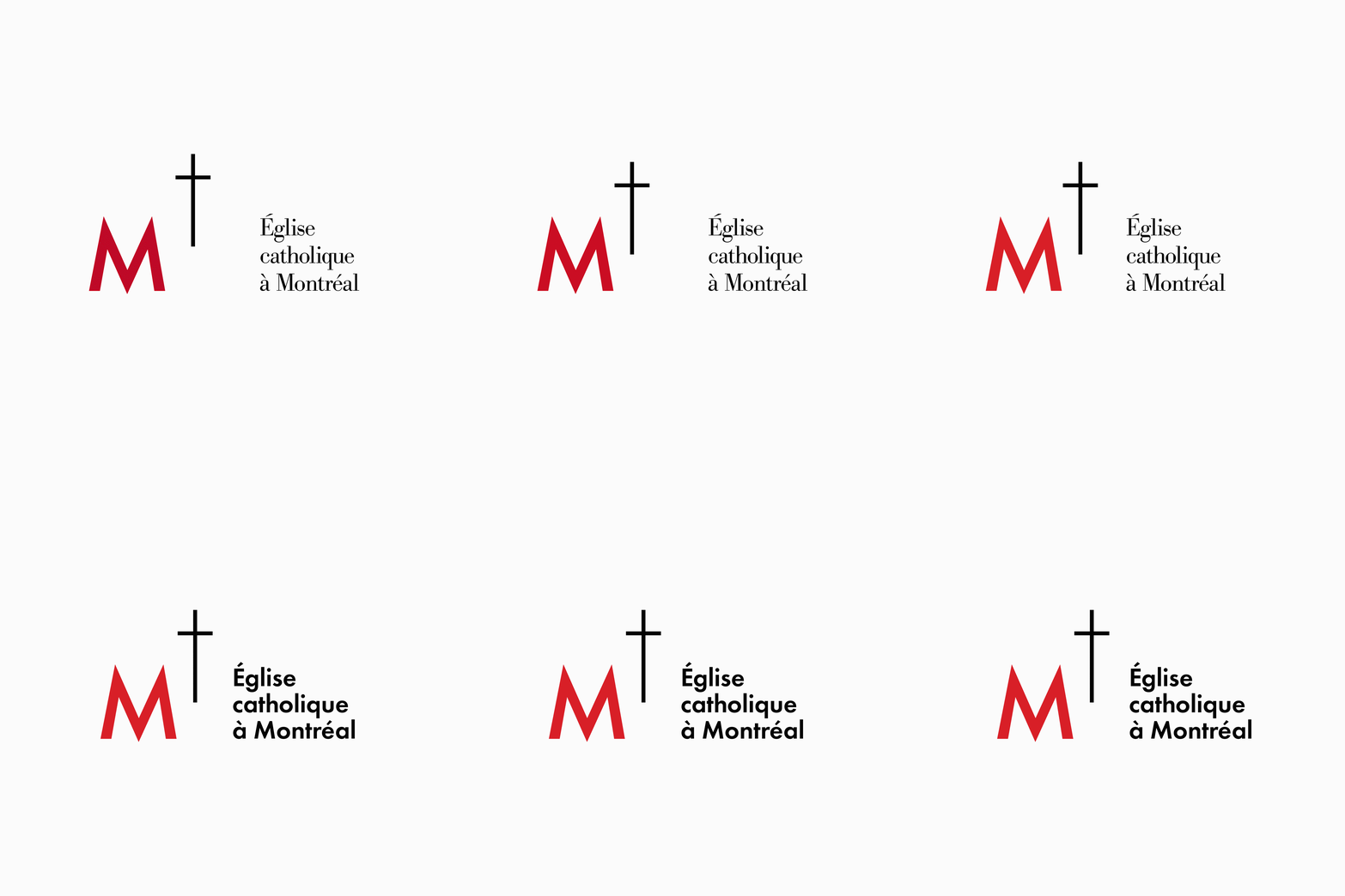
The Roman Catholic Archdiocese of Montreal, which includes the city of Montréal and surrounding areas, was established in 1836. Though the changes were minor, the logo was updated in 2018 to improve its versatility and legibility; particularly in digital applications.
The Communications Office of the Archdiocese of Montréal wanted to unify its many Offices and Services under the same logo system. As an internal designer, I had proposed a few small changes to make the current logo more versatile and legible.
Firstly, the negative space between logo elements was reduced to reduce the overall height and improve their visual relationship. This also allows the logo to be more practical in digital applications where space can often be limited.
Secondly, the typeface was changed to complement the logomark's style. Not only did the previous serif typeface seem unrelated to the main symbol, it was also often difficult to read in smaller logo applications. Lastly, a slightly bolder red was chosen to attract more attention on screens.
The rest of this project was handed over to an external designer after my proposal was approved.

